-
Property management system

Used by thousands of rental agencies worldwide, the new automated property management system offers a more intuitive, powerful and device-friendly experience than existing banking or competitor platforms.
Pain points
- Users had access to large amounts of property data, but little that helped drive meaningful business decisions.
- Core user flows were overly complex and not tailored to the needs of different personas.
- The interface felt “sales-centred” rather than user-centred and task-oriented.
- Search and filtering issues made it difficult for users to quickly find the information they needed.
- The experience lacked intuitiveness and moments of dynamism that support efficient navigation.
- There were no communication features, resulting in a static, disconnected experience.
- The platform needed to serve multiple audiences — landlords, letting agents, and third-party users — but did not adequately address their differing needs.
The Goal
Simplify the overall experience and optimise key flows for all user types.
Surface core value immediately through a clearer, more dynamic dashboard.
Introduce new features and alternative interaction methods that extend usability beyond the core application.
Create dedicated areas for additional content types to increase engagement and drive repeat usage.
* Testing different layouts
The solution
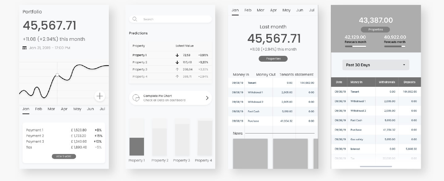
The homepage and search experience were redesigned to minimise friction and reduce unnecessary upfront input. Since payments occur only once a month, the interface no longer relies on a complex, interactive graph. Instead, the design highlights the previous month's performance with quick access to dates, properties, and key insights.
Property selector
The property filtering process was streamlined by removing several unnecessary steps. This significantly improved usability, reduced cognitive load, and created a cleaner, more intuitive visual experience.
Search
The search journey was restructured into a series of simpler, guided steps. This allows users to reach listings with minimal effort — even without providing dates or additional filters — making the experience faster, more flexible, and more user-friendly.

Colour plays a far deeper role than simple identification.
Studies show that people form a subconscious judgement about a product within the first 90 seconds of viewing it — and up to 90% of that judgement is influenced by colour alone.
Communication
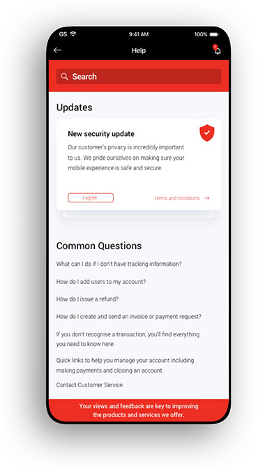
Communication is an essential part of users’ daily behaviour, so a new feature was introduced to help them connect within their network. Users can share and view properties of interest and provide simple, quick feedback such as “like” or “dislike.” To validate the idea, this feature was initially placed in the Help section to gather insights before rolling it out more broadly across the platform.
Progress bar
A guided three-step flow was introduced to help users complete key tasks without friction. The progress bar provides clear direction, reduces uncertainty, and keeps users engaged throughout the process.
Additional information
The Updates section was redesigned to adapt dynamically based on user behaviour and persona needs. By leveraging behavioural data, the experience surfaces more relevant content, helping users stay informed and reducing unnecessary navigation.